App showcase
Developed a design strategy to enhance product discovery and boost sales for a SaaS platform.
United States, 2022
My Role
UX Designer responsible for the app store feature, from definition to handoff
Team
1 UX Designer
1 UI Designer
1 Design Manager
Way of working
Kick-off meeting with stakeholders;
Weekly meetings with stakeholders for validations and refinements;
Eventual collaboration with UI Designer.
Duration
3 months.
The business problem
Low number of sales of other products, apart from the flagship.
Problem reported by stakeholders at the kick-off meeting.
Understanding the problem
The company had 23 tools that were only offered on its website and not within the Cloud suite.
Their website users were different from their Cloud suite users.
Insight captured through qualitative research I carried out with Marketing and Customer Experience managers.
Framing the solution
Goals
User
Get useful tools to facilitate their job.
Business
Increase the number of sales of other products.
Product
Offer the products within the platform in a fluid manner, without affecting usability.
Product vision and goals defined in the workshop I planned and ran with key stakeholders.
UX & UI Research
Key findings
Offers and recommendations
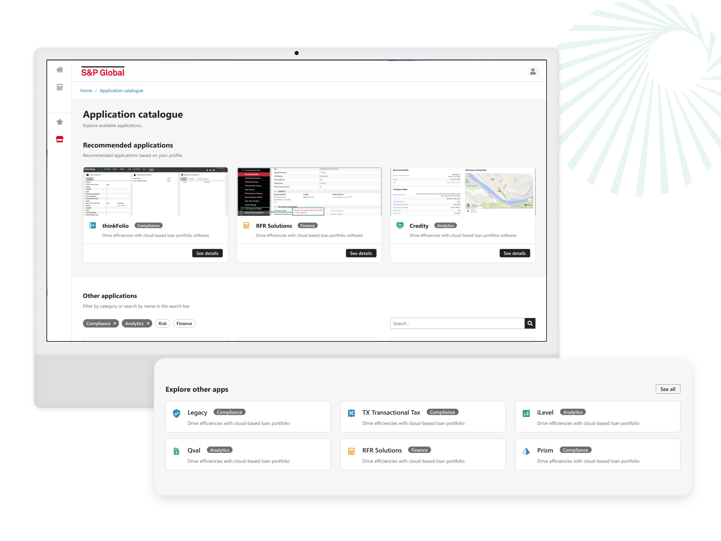
Based on the user's profile, to increase the relevance of the offer and and increase value delivery.
Filters and search bar
Search bar combined with category filters to facilitate the product search.
Product showcase
Products showcased with image + icon + short description, to give a better idea of the product.
Exploring the solution
Before jumping straight into prototyping, I presented my research to the stakeholders, along with the sketches I designed, to validate the user flow, information architecture, and to discuss the technical capability of the proposed solution.
After approval from the client, I designed a high-fidelity prototype in Figma, using the components and guidelines from the client library.
In partnership with the client-side UI designer, I designed a new card component to be applied to the home and category screens.
Usability test
Check whether participants can perceive the product offer on the Home screen
Verify if participants can search for different products
Analyse how participants search for more product information
Collect information on the "request information" button
Collect data on product ease of use
“Super clear, and in line with a lot of websites”
“It'd be good if we could see some screenshots of the applications”
Refinements and recommendations
I changed the button hierarchy to make it more prominent on the screen
I suggested using software screenshots in the ‘Recommended’ section, to add value by providing a more comprehensive understanding of the product
Final Design
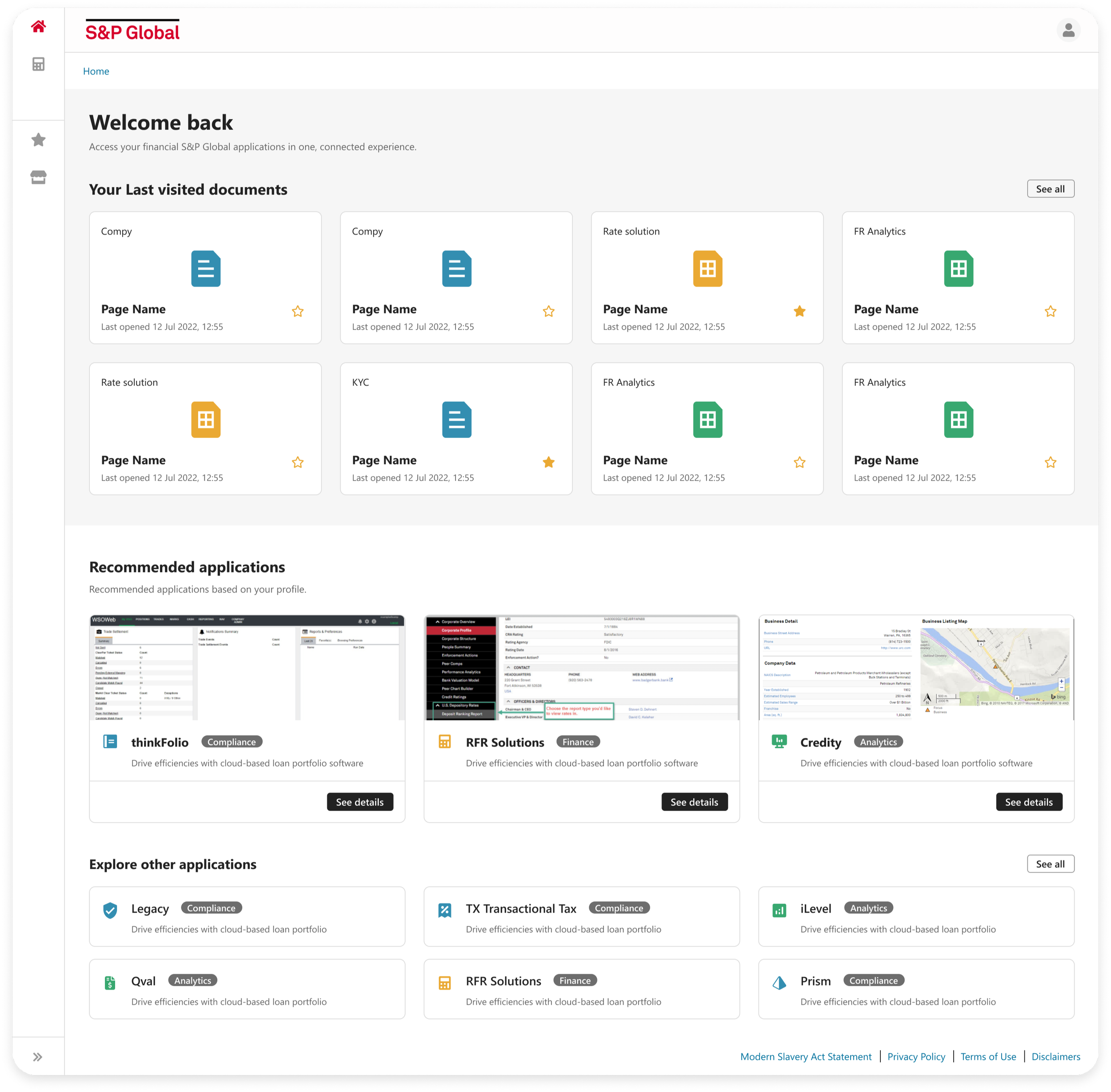
Home
Addition of the Recommended apps section in the Home, for easy viewing and smooth usage.
Inclusion of the App store in global navigation, to facilitate access from any page
Product catalogue
Recommended apps based on user profile to increase value delivery
Featured applications with the greatest match with the user profile
Product search facilitated by search bar and category tags
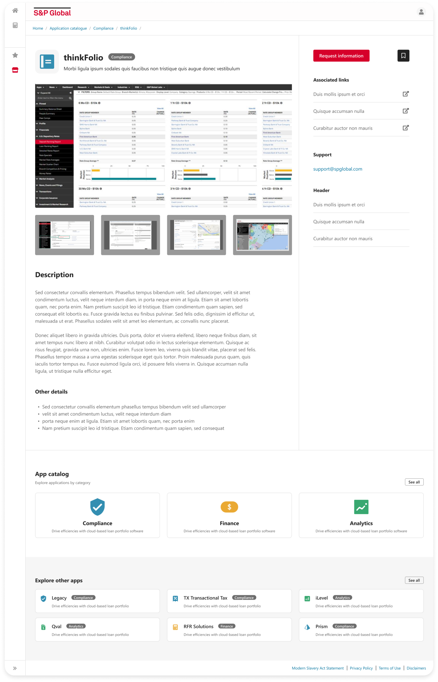
Product details
'Request Information' button that opens a form and routes it to the appropriate sales team, to reduce the number of calls.
Enhanced the product description and added technical information to decrease the call volume
‘Explore other apps’ section based on the product is being viewed for a more intuitive user experience
Next steps and takeaways
I suggested tracking the ‘Request Information’ button to quantify clicks and thus verify its effectiveness.
I suggested tracking views and access to products through the 'Recommended apps' section, and also to the product showcase through the 'See all' button on the Home page, to check the effectiveness of inserting the application showcase into the Home.
In future projects, to understand a robust design system more quickly, I will suggest more frequent contact with the UI designer, with weekly checkpoints.
As a UX consultant, I would prefer to have weekly checkpoints with the developers rather than communicating with them via stakeholders, to facilitate our communication and speed up the process.


